My questionnaires were very successful in terms of giving me a clear idea of how my magazine would do in the market. I summed up five candidates answers to make a conclusion on how successful my magazine would be.
Candidate NO. 1
For question number one about consistency they gave me a 7.
For question number two- YES.
For question number three- 8.
For question number four- YES.
For question number five- YES.
For question number six- YES.
Candidate NO. 2
For question number one about consistency they gave me a 8.
For question number two- YES.
For question number three- 7.
For question number four- YES.
For question number five- YES.
For question number six- YES.
Candidate NO. 3
For question number one about consistency they gave me a 8.
For question number two- YES.
For question number three- 8.
For question number four- YES.
For question number five- YES.
For question number six- YES.
Candidate NO. 4
For question number one about consistency they gave me a 7.
For question number two- YES.
For question number three- 7.
For question number four- YES.
For question number five- YES.
For question number six- YES.
Candidate NO. 5
For question number one about consistency they gave me a 8.
For question number two- YES.
For question number three- 9.
For question number four- YES.
For question number five- YES.
For question number six- YES.
This qualatative data has give me a clear idea and overall I'm impressed with the average scored I recieved for my photography skills as I thought they was potentionally very good for myself- as I do not have any photography or camera skills.
For question seven, the overal comments were postive. I know from the positive critcism I gained, that if I was to be improving my magazine further more I would have more photos of other people and not just of one model and one gender. Also to add I'd try and add more colours to match with my colour scheme for that paticular issue, as I just tended to stick with three colours: pink, black and white.
However overall I am happy with my finished product and if I was to change anything in the process of making my magazine I would of managed my time more carefully.
Friday, 15 April 2011


Final evaluation.
My media product is a magazine. It does not really challenge the forms and conventions however it does develop on the idea of how magazines conventionally and traditionally look. Original features that appear on magazines are displayed on mine, for example the masthead, strap lines, barcode, images, website address and quotations. These features can be challenged by having more quotations or reducing the amount to keep it simple and sophisticated. I have done this because I think my target audience may want to read the contents, but the images and the colours are what’s powerful and will strike my audience when they first see my product. Also a magazine industry could challenge the norms by avoiding continuity in their magazine. They could ignore having a particular house style with colours and font but it would not be practical. However, in contrast to this I have kept similar fonts throughout and the same colour scheme. This makes my medium look more professional and this may attract more of an audience that I’m targeting. From the feedback I received I found that I did a good job with handling consistency in my magazine. The average score I got back from my feedback for continuity for colours and fonts I used was seven, with ten been the highest score.
My magazine has offers that will attract my target audience because of the genre choice I have decided to work with. It has a range of big artists that are in the top ten at the moment such as Rihanna, Nicki Minaj and Kayne West. With my offer for winning tickets to go and see Rihanna in concert where Kayne West and Nicki Minaj will be starring, hopefully this would urge my audience to buy my magazine to try and win this amazing opportunity. My social group on the demographic scale that I’m targeting is C1 and E . My magazine is also for both genders. My magazine in this issue suggests a woman dominated product but it will vary and will supply for both genders no matter what sex the model is. My magazine is affordable and by choosing this diverse demographic group I can then decide what I should do to also target maybe a higher class audience to gain more profit as my magazine sells at two pounds and fifty pence. My magazine represents my target audience because of the number of choices I have made, such as the gender of my model, females may aspire to look like her and males may well be sexually attracted to her. My images could be the crucial part of someone buying my magazine or putting it back on the shelf, so I think that the age of the model must show youth because I’m targeting fifteen year old to twenty four year olds. Also the images attract my audience because of my front cover image been very powerful, central and a medium close up. It draws the reader into her world that she is in, and the interview inside the magazine helps intrigue the audience more. The image on my double page is very similar she stands to the side of the graffiti for the text and it is like as if she is looking at something, something the reader cannot see giving them the impression she is looking forward at something that’s coming next into her career and future that the reader should be excited about.
I feel that ‘NME’ would be a potential institution that may distribute my magazine because our magazines are the complete opposite to one another. We both target a young age and have a block three letter masthead which could show continuity throughout their institution. To do this I would use a similar font to NME . It would not be the same because I think showing the difference between the two magazines is crucial. I think because of the massive contrast between the music genre choices, selling both under the same institution shows that they can target a much wider audience.
I decided to target this audience because a lot of magazines target this niche audience and because there is competition between different mediums it makes me want to see what more I can add to make my magazine more successful than others, which then would obviously make my target audience want to purchase my magazine instead of others. From my audience feedback I found that ‘more offers and enticements would gain more audience attention’. The difference between fifteen year olds and twenty four year olds is significant so the context has to satisfy all the ages in this gap. I feel like I have done this by making my magazine look sophisticated but still with lots of features to read about. The mise-en-scene I chose showed a hard stereotyped background and because my model was female it connotes that she was confident and brave been in such a ‘rough’ area. Also the graffiti connotes a wild, rebellious life and R&B artists can be attactched to this stereotype especially men so with a female model I felt I broke the norm. The camera shots are varied, a medium close up for the front cover, for the contents page a close up and for the double page spread a medium long shot. The difference in shots shows the variation in my magazine and how different the features are.
I have learnt from this process that Photoshop is a difficult technology program to use however once practising I realised that I was capable of doing a lot of things to edit my photos and make my magazine look really professional and up to a marketing standard. I took my photos with a LUMIX professional photography camera. I took photos at different angles and ranged my distances. By taking close- ups, medium close- ups and long shots I have shown a range of images which can create different meanings. For example a close- up can create intensity. Furthermore a long shot can connote power as their full image and body has taken up the full page. The outfit that my model is wearing connotes power. She is wearing black which creates a controlling look and makes her look dominant in her picture and the environment she is in. The pink font I have chosen contrasts well with the black and white and stands out and shows the models feminine side. As she is wearing all black it shows her masculine side as a R&B artist but the pink brightens up the tenor on the page and makes it more eye catching.
I think publisher is an easy program to use, however it does not give the overall affect of professionalism as Photoshop does. There is a significant difference between the quality of work that i would produce if I was to use publisher to design my magazine. By using Photoshop I have achieved both a quality and professional piece of work.
Due to my better understanding of Photoshop from my last assignment and better understanding of the conventions I feel I have improved a lot since I designed my college magazine. I think that the difference of my planning really made things more challenging. The music magazine had to be in more detail than the college one and I can see in my work the difference between the both, and why the music magazine needed a lot more planning and consideration because it does need to look that more believable because if it was to go into the market it would need to sell.
Thursday, 14 April 2011

Monday, 11 April 2011
First draft of evaluation.
My media product is a magazine. It does not really challenge the forms and conventions however it does develop on the idea of how magazines conventionally and traditionally look. Original features that appear on magazines are displayed on mine, for example the masthead, strap lines, barcode, images, website address, quotations and many more. These features can be challenged by having more quotations or reducing the amount to keep it simple and sophisticated. I have done this because I think my target audience may want to read the contents, but the images and the colours is what’s powerful and will strike my audience when they first see my product. Also a magazine industry could challenge the norms by neglecting continuity in their magazine. They could ignore having a particular house style with colours and font; however, in contrast to this I have kept similar fonts throughout and the same colour scheme. This makes my medium look more professional and this may attract more of an audience that I’m targeting. From the feedback I received I found that I did a good job with handling consistency in my magazine. The average score I got back from my feedback for continuity for colours and fonts I used was seven, with ten been the highest score.
My magazine has offers that will attract my target audience because of the genre choice I have decided to work with. It has a range of big artists that are in the top ten at the moment such as Rihanna, Nicki Minaj and Kayne West. With my offer for winning tickets to go and see Rihanna in concert where Kayne West and Nicki Minaj will be staring, hopefully this would urge my audience to buy my magazine to try and win this amazing opportunity. My social group on the demographic scale that I’m targeting is C1 and E. My magazine is affordable and by choosing this category I can then decide what I should do to also target maybe a higher class audience to gain more profit as my magazine sells at two pounds and fifty pence. My magazine represents my target audience because of the number of choices I have made, such as the gender of my model, females may aspire to look like her and males may well be sexually attracted to her. My images could be the crucial part of someone buying my magazine or putting it back on the shelf, so I think that the age of the model must show youth because I’m targeting fifteen year old to twenty four year olds. Also the images attract my audience because of my front cover image been very powerful, central and a medium close up. It draws the reader into her world that she is in, and the interview inside the magazine helps intrigue the audience more. The image on my double page is very similar she stands to the side of the graffiti for the text and it is like as if she is looking at something, something the reader cannot see giving them the impression she is looking forward at something that’s coming next into her career and future that the reader should be excited about.
I feel that ‘NME’ would be a potential institution that may distribute my magazine because our magazines are the complete opposite to one another. We both target a young age and have a block three letter masthead which could show continuity throughout their institution. However because of the massive contrast between the music genre choices, selling both under the same institution shows that they can target a much wider audience.
I decided to target this audience because a lot of magazines target this niche audience and because there is competition between different mediums it makes me want to see what more I can add to make my magazine more successful than others, which then would obviously make my target audience want to purchase my magazine instead of others. From my audience feedback I found that ‘more offers and enticements would gain more audience attention’. The difference between fifteen year olds and twenty four year olds is significant so the context has to satisfy all the ages in this gap. I feel like I have done this by making my magazine look sophisticated but still with lots of features to read about. The mise-en-scene I chose showed a hard stereotyped background and because my model was female it connotes that she was confident and brave been in such a ‘rough’ area. Also the graffiti connotes a wild, rebellious life and R&B artists can be attactched to this stereotype especially men so with a female model I felt I broke the norm. The camera shots are varied, a medium close up for the front cover, for the contents page a close up and for the double page spread a medium long shot. The difference in shots shows the variation in my magazine and how different the features are.
I have learnt from this process that Photoshop is a difficult technology program to use however once practising I realised that I was capable of doing a lot of things to edit my photos and make my magazine look really professional and up to a marketing standard. If you were to compare Photoshop with Publisher the quality difference is significant it would not be as believable if it was done on publisher. Therefore this is why I used publisher to design and create my magazine.
Due to my better understanding of Photoshop from my last assignment and better understanding of the conventions I feel I have improved a lot since I designed my college magazine. I think that the difference of planning really made things more challenging, the music magazine had to be in more detail than the college one and I can see in my work the difference between the both, and why the music magazine needed a lot more planning and consideration because it does need to look that more believable because if it was to go into the market it would need to sell.
Friday, 11 March 2011


Thursday, 10 March 2011
process
 Change of barcode and date placement, challenging conventions.
 This is my front cover to start with.
  This is my final product of my double page spread. I wanted a font to show sophostication aswel as 'girliness'. The pink and the black contrast, showing her elegant side with the pink and deviant side with the black.

Monday, 7 March 2011
photos.


 I didn't use this photo because of the scenery. The bin in the background does not make this photograph look professional. I tried to edit around it however it did not look professional enough and up to magazine standard.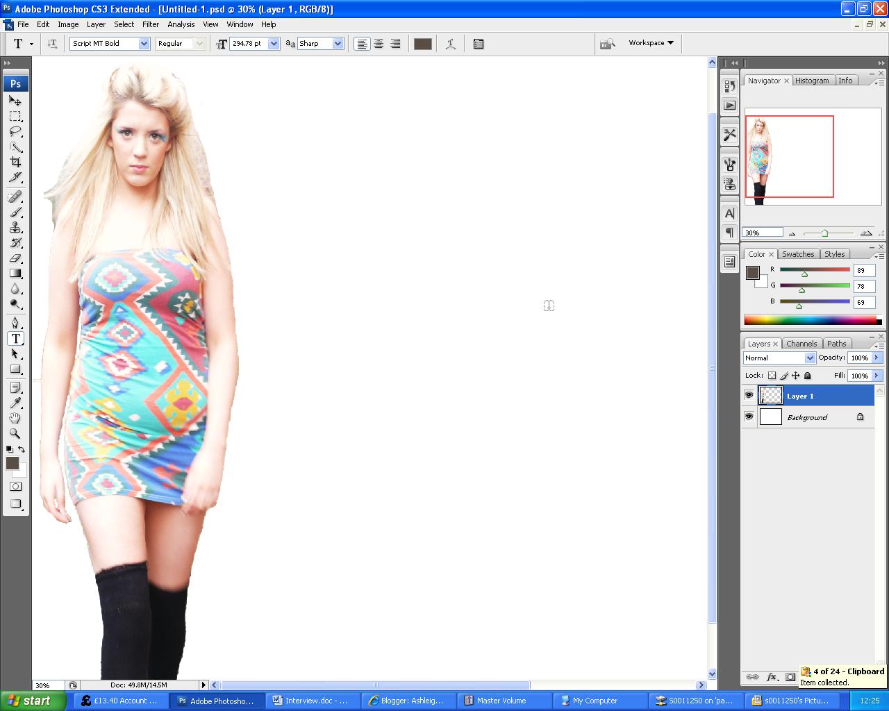
I think that in today's society celebrities have become 'Lady Ga Ga' inspired. Her extravagant new looks have modernised the way a lot of artists dress in their music videos. The new wild 'in yer face' look has blown away the nation and that's what artists need to do to impress their audience, i would also think that it makes them stand out and makes them more noticeable. However if they're all following one particular style they will all become 'the same' again.
Interview.
I: Hello Kaci..
K: Hello Cheryl..
I: So, we love your new single ‘shift’! is the rest of your album going to be as extravagant?
K: Thank you! Yes hopefully. I have a few collaborations with artists such as T.I and P.Diddy. they’re really fun songs, and really lovely people to work with.
I: Was you intimidated at all working with such big artists?
K: Hmm, yes a bit. But they’re so down to earth and such a laugh in the studio. We worked really hard and was intense at times in the studio but apart from that the songs are great and I absolutely love the music videos!
I: You obviously have a lot of competition in the music industry, not just R&B artists but other artists as well. At times do you feel the pressure?
K: Oh yes, definitely of course! But I try to see it as a good thing. It makes me work harder and it encourages me to push myself to the limit.
I: Your next tour starts on the 15th doesn’t it?
K: Yes, 15th January very excited. ‘Eeee’. (Laughs) Its going to be amazing.
I: I can’t wait either! So do you get stage fright when up in front of such a massive audience? I know I would!
K: OH MY GOD! Definitely. I get such bad butterflies, I get so nervous I can’t even eat and then half way through the performance my stomach is roaring “FEED ME”! (laughs).
I: (Laughs)
K: But as soon as I’m on stage the adrenalin kicks in and everything seems to come so naturally, and then I just own the stage (laughs). My fans are so encouraging as well, they’re so amazing. I love them!
I: We love you too!
K: Aww’. Thanks!
I: Have you always being so confident then?
K: Not at all. I remember in school, I was the always the one who was bullied. I mean that’s why I’m very find of sponsoring and helping the bulling systems in America and in the U.K.
I: Oh yes I’ve heard, you’re a very generous person. That’s lovely. Some people really do get the wrong impression of R&B artists sometimes don’t you think?
K: Yes! We get stereotyped as ‘hard’ women or men and our emotions are only through our lyrics, but where as down to earth as any other artists.
I: I should hope you are (laughs). Well thanks for your time, we hope to see you again sometime. The best of luck with your tour, and your album.
K: My pleasure, thank you for letting me come. And thanks, it will be good to see you again sometime.
Friday, 10 December 2010
Drafts of intial ideas.
 This is a rough draft of how i want my magazine front cover to look like. I gained inspiration from the vibe magazine front cover as i thought that as she is posed naked it shows confidence and for this month my magazine is about confidence. I want minimal images i just want one main one and then cover lines surrounding it. I think this shows sophistication. Instead of cramming my cover page with lots of images like the Billboard magazine did in 2005 and then a year later they improved it and just made it one image which for me makes a magazine look more professional.
 I want my double page spread to be consistent with my front cover and contents page,minimising the amount of text used.
  My interview is for this page. The ideology of different levels in the images on the first page continues into my interview with the level of the text boxes going from large to small.
 Monday, 6 December 2010
Price and how often my magazine will be published.
I think my magazine will be priced at £2.00 I know this way that it will be affordable for both sides of the social demographic scale. This price will suit my target audience perfectly. I aiming at C1-A, however I do want to gain a percentage of C2-E to purchase my magazine as well. It will be published and released in stores weekly. It will be published monthly because £2.50 is definitely affordable for the higher class to purchase, and as they are my main target audience I will please their needs by releasing classic updates on R&B music. To expand on this it gives me time to maintain quality context by releasing my magazine monthly. As the age group is 15-24 it maybe more of the older aged students purchasing my magazine however it will depend on the younger target audiences background, as they will probably be from a wealthy background £2.50 should be no problem for the quality of information and entertainment they're retrieving when purchasing my magazine.

Different coloured barcode gives me an idea of changing the traditional norm of having a plain black and white on my front cover. these could be potential barcodes that i could show my price on. 

Target audience.
I'm going to apply to a niche audience in society. I'm targeting people who enjoy the R&B genre, to do this i will be looking a a number of different aspects that will affect the choices I make in designing my magazine and writing my article. I will examine points similar to what Hartley in 1982 studied to understand the news, such as self image, gender, age group, family, social class, nation and ethnicity. I will also make sure I will appreciate sexuality and religion. Because the music genre I have chosen attracts a younger audience the age group I will be targeting is 15-24 for both sexes, and for social demographics I'm going to be targeting C1-A class. I've chose to target that area because of the research I have done.I have realized that many magazines who sell R&B genre in their magazines sell well to that particular class of people and if I was to sell my magazine I want to target an audience who can afford it and and buy it regularly. On the other hand i know that it would be appreciated by an audience with social demographics C2-E if i made it cheaper, this is were i have thought about reconsidering my price and lowering it to be affordable to both groups of classes so my magazine has a good reputation.
•
Sunday, 5 December 2010
liiar interpretation of billboards double page spread.

The title 'MUSIC' is in the same font as the titles on the contents page this shows the magazine maintains consistency throughout the magazine and and using the border lines again however in a different colour shows a maintenance in the particular house style they have created. They have used the same colours that are used in the masthead. The layout is very textual, it has eight columns and an extra column on the right hand side highlighted in yellow, another colour which is used in the masthead. The highlighted column has sub-title called the 'latest buzz',this being highlighted yellow is definitely eye catching and grab the readers attention.
The band in the main image are wearing black to go with the colour scheme, the man at the front is also wearing a red tie which again ties in well with red borderlines. Compared to 'VIBE's double page spread its not focusing on one main artist, it has three different topics which it focuses on. On the first page the main focus is 'INTO THE FIRE' and on the second page there is another main focus called 'Tropical Paradise'. This shows that 'Billboard' magazine may have more to offer, or it shows that 'VIBE' like to pay attention to a certain artist and focus on that in detail to show they have interest in particular artists. On the other hand its shows that Billboard magazine have variation.
liiar interpretation of billboard contents page.

The contents page has a lot of text, and four images, three across the top seperated and one main image at the right hand side making the text look more interesting. It makes the text look more appealing and seperates it up to give the impression that there isn't that much text. on the left hand side there is a list of the top music in the charts this immediately tells the reader that as soon as they open the first page to the magazine they are bombarded with music information.
The magazine has remained consistant because it has used the colours in the masthead in the charts list and the blue for the border lines and the text for the main features in the magazine. The main colours used are blue white and black, in the main image the women is wearing a black outfit which contrasts well against the white background. Compared to 'VIBES' contents page this page has more images, and it doesnt show any dominance of any paticular sex. Also the images across the top in frames have numbers in the corners this could be to minimlise text. The font for contents and No1 is the same showing consistancy.
Thursday, 2 December 2010
liiar interpretation of Billboard magazine.

L- The grey background and dark Grey jacket that Gaga wears lets the light tone colours stand out, the colours in the masthead and Gaga's hair, because the background is dark it immediately draws attention towards her and her image as it known for being so creative and surreal. Again there is similarities with the 'VIBE' magazine front cover because they both expose themselves showing they're confident artists.
I- Their personal selling line is 'The Publishers Quaterly'. The Billboard has being part of the media entertaining an audience since 1984. There site gives information on where abouts their magazine is sold http://www.billboard.com/#/footer/about-us.
From 2005 to 2009 this shows how the magazine has changed and since 2006 they have shown consistency in having minimal pictures on the front cover.
15th January 2005

11th March 2006

29th November 2008

28th November 2009

I&A- We can tell this magazine is a world wide magazine because one of its cover lines is 'ITUNES INVADES MEXICO' we notice that this magazine applies to world wide audience of young students who enjoy music. The image gives off that typical confidence of an artist, and because Lady Gaga is known for her high levels of confidence and wacky costumes the magazine is just not applying to an audience that just likes R&B they balance pop music and more. Again I think because of the quality of the layout and the images it focus on a target audience C1-A.
R- The image shows sophiostication as she is wearing a blazer and the star has limited her usual wild image to show the magazine cover has taken control over her becuase its powerful, big and needs to please an audience as some people may not like her image.
Subscribe to:
Posts (Atom)